
[Date Prev][Date Next][Thread Prev][Thread Next][Date Index][Thread Index]
[IDV #WAX-506623]: Color bleeds across colored contours unacceptably
This archive contains answers to questions sent to Unidata support through mid-2025. Note that the archive is no longer being updated. We provide the archive for reference; many of the answers presented here remain technically correct, even if somewhat outdated. For the most up-to-date information on the use of NSF Unidata software and data services, please consult the Software Documentation first.
- Subject: [IDV #WAX-506623]: Color bleeds across colored contours unacceptably
- Date: Thu, 21 Jan 2016 17:24:23 -0700
Brian,

This is what matplotlib does. See attached.

Best,

Unidata IDV Support

> Animated gif with numerous, fat contours is clearer
>
> [cid:76F2C985-9C25-4213-B9FB-DB0E76605743@attlocal.net]
>
>
> On Jan 20, 2016, at 10:37 PM, Brian Mapes
> <address@hidden<mailto:address@hidden>> wrote:
>
> Oh, I notice that smoothing was on in the contour display. When I set the
> countours unsmoothed,there is still some purple (color mixing), but it is all
> within pixel scale it seems.
>
>
> <PastedGraphic-6.png>
>
> <IDVcont.colormixing.gif>
>
>
>
>
> On Jan 20, 2016, at 7:31 PM, Unidata IDV Support
> <address@hidden<mailto:address@hidden>> wrote:
>
> Brian,
>
> Yes, I don't think it is a problem with the color scale. This may be a subtle
> contouring artifact where the contouring algorithm is drifting into areas in
> shouldn't, if you see what I mean. This is something you would never notice
> except in these two-tone scenarios. (I would continue experimenting with the
> contouring parameters rather than the color table at this point.)
>
> Can you explain to me how you are deriving DTdy? I am curious how other
> plotting packages handle these data.
>
> Best,
>
> Unidata IDV Support
>
> I wonder if it is a matter of having only 6 colors in the table?
>
> No, I made it more (still half red, half blue) using the + in the color table
> editor, and changed the range, and the contours are still woozy purplish .
> So it is not some color-interpolation thing I think.
>
>
>
> On Jan 20, 2016, at 6:44 PM, Unidata IDV Support
> <address@hidden<mailto:address@hidden>> wrote:
>
> Brian,
>
> Thinking about this a bit more, I don't believe there is a bug or problem
> here.
>
> The color table is being displayed in exactly the manner you wish. In
> particular, where you are seeing "blending" are areas where values in the
> contour data are actually going back and forth across zero and therefore are
> mixed
> purple. It is not the colors that are blending, it is the data themselves
> across
> the "zero boundary".
>
> Another way of looking at this is choosing a two tone black and white color
> table. The white will fade into the background. You will see grey as the data
> approach either side of zero.
>
> Do you buy this theory? :-)
>
> Best,
>
> Unidata IDV Support
>
> Same issue when I import this new table.
> Contours are not uniform red or blue, but mixed purple.
> Thicker contour line width helps show it.
>
> [cid:3EC5425C-85EE-4B22-87E4-1F10BC1A1C6C]
>
>
>
>
>
> On Jan 20, 2016, at 3:16 PM, Unidata IDV Support
> <address@hidden<mailto:address@hidden><mailto:address@hidden>> wrote:
>
> Brian,
>
> It is not that the colors are bleeding, it is your color table that appears to
> be discreet, but apparently is not. Remove all other displays and you will see
> what I mean. I am unfortunately having trouble loading your bundle though I
> did
> get it to load once where I was able to come to that conclusion.
>
> Try the attached color table which I believe is actually discreet.
>
> Best,
>
> Unidata IDV Support
>
>
>
> See how some of the contours are purplish? The color bar is purely blue/red .
>
> Is it a bug, or something we have to live with?
> Small .zidv bundle attached along with screenshot.
>
> Brian
>
>
>
>
>
>
>
>
>
> Ticket Details
> ===================
> Ticket ID: WAX-506623
> Department: Support IDV
> Priority: Normal
> Status: Open
>
>
> =
>
>
>
> *********************************************
> Brian Mapes, Professor
> Department of Atmospheric Sciences
> Meteorology and Physical Oceanography Program
> RSMAS, University of Miami
> 4600 Rickenbacker Causeway
> Miami, FL 33149-1098
>
> phone: (305) 421-4275
> fax: (305) 421-4696
> email: address@hidden<mailto:address@hidden>
> Web: http://www.rsmas.miami.edu/users/bmapes/
> **********************************************
>
>
>
>
>
>


Ticket Details
===================
Ticket ID: WAX-506623
Department: Support IDV
Priority: Normal
Status: Open
Attachment:
temp4.png
Description: PNG image
Attachment:
temp5.png
Description: PNG image
_______________________
MATPLOTLIB COMPARISON
_______________________
<2016-01-21 Thu>
Table of Contents
_________________
Brian,
At the end of this analysis, please find meridional temperature gradient
plots.
Let's grab some one degree GFS data from [unidata-server.cloudapp.net].
,----
| import netCDF4
| import numpy as np
| ds =
netCDF4.Dataset('http://unidata-server.cloudapp.net/thredds/dodsC/grib/NCEP/GFS/Global_onedeg/GFS_Global_onedeg_20160121_1200.grib2')
| ds
`----
Examine the `Temperature @ Isobaric surface' variable.
,----
| temp = ds.variables['Temperature_isobaric']
| temp
`----
Take a meridional slice from south to north pole. Also let's sanity
check the data shape.
Our usual imports Python plotting imports.
,----
| %matplotlib inline
|
| import matplotlib.pyplot as plt
| import matplotlib as mpl
`----
Plot up the temperature slice.
,----
| fig = plt.figure(figsize=(10, 5))
| ax = fig.add_subplot(111)
| ax.imshow(tempslice,interpolation='nearest', aspect='auto')
| plt.show()
`----
[file:image/temp.png]
Calculate the temperature derivative in the vertical dimension.
,----
| dTdz = np.gradient(tempslice)[0]
| np.shape(dTdz)
`----
(26, 181)
Define a two-tone color scale.
,----
| # make a color map of fixed colors
| cmap = mpl.colors.ListedColormap(['blue','red'])
| bounds=[-100.0,0.0,100.0]
| norm = mpl.colors.BoundaryNorm(bounds, cmap.N)
`----
Plot `dTdz'.
,----
| fig = plt.figure(figsize=(10, 5))
| ax = fig.add_subplot(111)
| ax.imshow(dTdz,cmap = cmap,interpolation='nearest', aspect='auto')
| plt.gca().invert_yaxis()
| plt.show()
`----
[file:image/temp2.png]
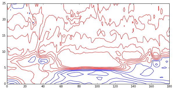
Contours we will plot, but don't plot zero.
,----
| levels = np.ma.masked_inside(np.arange(-10.0,10.0,1.0), -0.01, 0.01)
`----
Plot `dTdz' with contours.
,----
| fig = plt.figure(figsize=(10, 5))
| plt.contour(dTdz,cmap = cmap,levels=levels)
| plt.show()
`----
[file:image/temp4.png]
Overlay contours on top of data.
,----
| fig = plt.figure(figsize=(10, 5))
| ax = fig.add_subplot(111)
| ax.imshow(dTdz,cmap = cmap,interpolation='nearest', aspect='auto', alpha=0.2)
|
| cs = plt.contour(dTdz, cmap = cmap, levels=levels)
| #plt.clabel(cs, cs.levels[::1], inline=True, fontsize=10)
| plt.gca().invert_yaxis()
| plt.show()
`----
[file:image/temp5.png]
[unidata-server.cloudapp.net] http://unidata-server.cloudapp.net
- Prev by Date: [IDV #CKM-561627]: problem with drawing/location controls
- Next by Date: [IDV #CKM-561627]: problem with drawing/location controls
- Previous by thread: [IDV #WAX-506623]: Color bleeds across colored contours unacceptably
- Next by thread: [IDV #WAX-506623]: Color bleeds across colored contours unacceptably
- Index(es):